Karen Li.
Today, we feature a bit of mathematics before the commencement of Lynbrook's first annual Hunger Games. Our Statistician today had his work cut out for him. He was writing his article in some trendy hipster online text editor (because that's what the cool people do these days) when his session timed out and he lost all his work. He was crushed. So he did what any logical person would do.
He hacked his own computer to retrieve the data. He had dumped all his RAM into a file that was 3 megabytes large, so he sifted through all that memory to recover his data. It's okay, we have no idea what any of that means either. In simpler terms, he was looking for a few tens of lines of text in a file with 150,000 lines. This is why we love this man. Without further ado, here is the fourth installment of “Spoontistics”:
Welcome to another fun episode of Spoontistics. Today we'll see if people have been getting better at spoons over the course of the game! Note that this article will be a little more technical than usual. Buckle up your thinking caps to get ready for an adventure.
Let's open with a simple visual: Here are the daily death rates over time. This graph doesn't include days like like immunity days and WASC days because they kinda mess up the pattern. (Ahem. Sorry, Mr. Iams. I mean, I removed confounding variables that introduced outliers into the data.) I also fit a trendline on the data to show the general trend of the daily death rate.
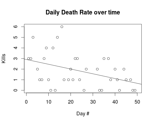 It's going down! Less people are dying as time goes on.
So people are getting better at spoons, right? Not so fast. There's two really important details that we glossed over. The first one is that we don't even know what the hell "better at spoons" means. Does it mean better at killing or better at staying alive? Those are two really, really, different things...one means that people more people die over time, and the other means that less people die over time...so that's not really useful. We can't say people are "better at spoons" in general. But we can say that people are "better at staying alive" because less people are dying as time goes on.
Or can we? It turns out, we can't. Not with this data. We missed something: even if people don't get better at spoons (whatever that means), the death rate is gonna go down over time anyways. Wait, what? Yeah. Skip to here if you're not interested in the math behind it.
To summarize: If people aren't getting better or worse at spoons, the average daily death rate still goes down over time. That's cuz less players means less possible deaths, which means less actual deaths.
But wait! If the death rate is supposed to go down even when people's skill level is constant, how do we tell if people are getting better? How do we know if the downwards slope from our first diagram is "natural" or if people are actually getting better at killing? The solution is to normalize the data by dividing by the number of people alive.
Rather than looking at the number of deaths on a given day, we'll look at the percentage of alive players who died that day. Using percentage of deaths rather than number of deaths compensates for the fact that less players naturally means less deaths. (Think about it.) In fact, the statistic of "expected proportion of alive people dying in one day" directly relates to people's average skill level. By measuring this number over time, we can measure how good spooners are at killing people without the downward bias of raw kill counts. Let's see how the plot looks!
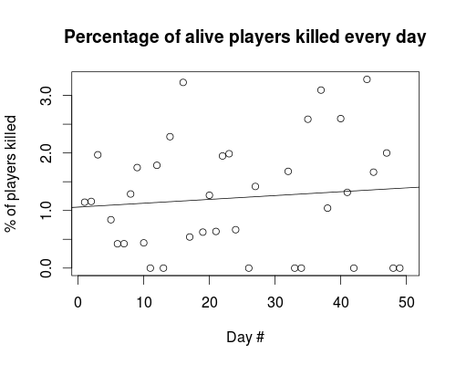 Hey ma, look! This graph is slopin' upwards. Does that mean people are getting better at killing over time? Not quite. The slope ain't steep enough to say with confidence that people's kill-skill rises over time. People are kinda getting better, but not significantly. The numbers prove it: a linear regression test gets you a really shitty p-value of like 0.56. There's a pretty good chance we coulda got this wimpy-ass upwards slope out of chance when people aren't getting better at spoons. So we don't really have evidence that people are gettin' better at spoons.
AHEM. Sorry, Mr. Iams. I mean, uh, the high p-value of 0.56 > 0.05 means that I fail to reject the null hypothesis thingy. The data from the daily cannon archives do not, erm, provide significant evidence that, like, um, the daily percentage of people dying in spoons increases over time. Yeah.
Sigh, I find it pretty ridiculous how you're supposed to use such unintelligible formal language for statistics. Mr. Iams pls...anwyays, I sincerely hope you guys enjoyed this post, and learned that statistics and math can be cool, useful, intuitive, and even beautiful!
tl;dr: People aren't getting better at killing each other in spoons. Until next time!